
Coming to the next major release of LookUp, is a new user interface for the app on iPadOS.
iPadOS 14 introduced a new form of layout for iPad devices: Sidebars. A departure from the tab bar interfaces, the new Sidebar layout focuses on a faster-flattened navigation, fewer full screen transitions and better utilisation of the screen space. LookUp will support this new layout in the next release of the app.
I wanted to highlight some of the work that's gone into designing for this new interface below, it's a major design change that has been months in the making; involving a lot of work on both usability as well as technical aspects of the design.
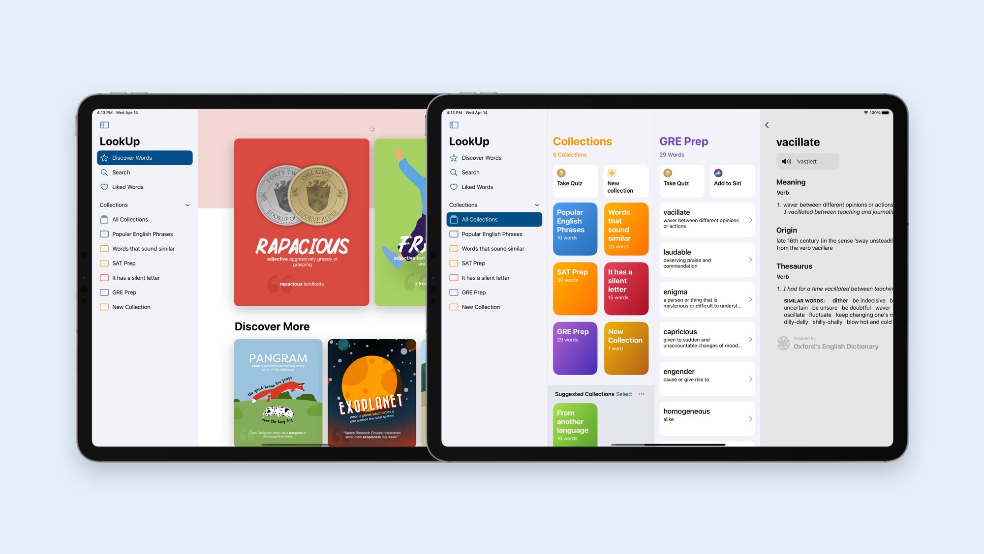
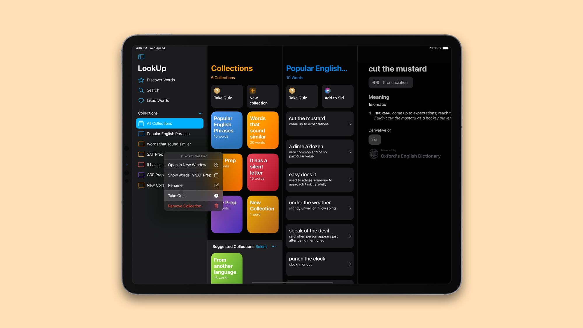
Multi-Column Navigation
Multi Column navigation is not new to LookUp. Our macOS app has made use of a multi-column layout for a very long time. The idea there, was to make use of the larger screenspace and give users a quick way to access their collected words. It's been very well received on that platform.
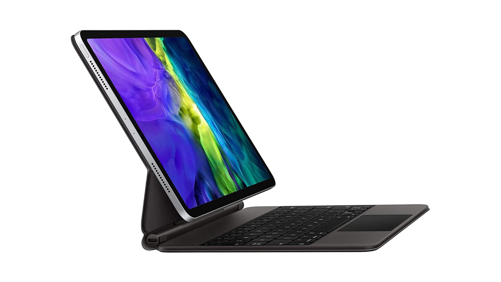
The iPad in many ways has moved closer to the Mac, with the introduction of the Magic Keyboard with trackpad. When the user uses the iPad in that mode, it creates a setup that's similar to the Mac in many ways, and with larger displays, even more so. It's a setup that just asks for a multi-column layout for a utility app like LookUp.
So taking a cue from the macOS our iPadOS app also makes use of the Sidebar and multi-column design to the app:
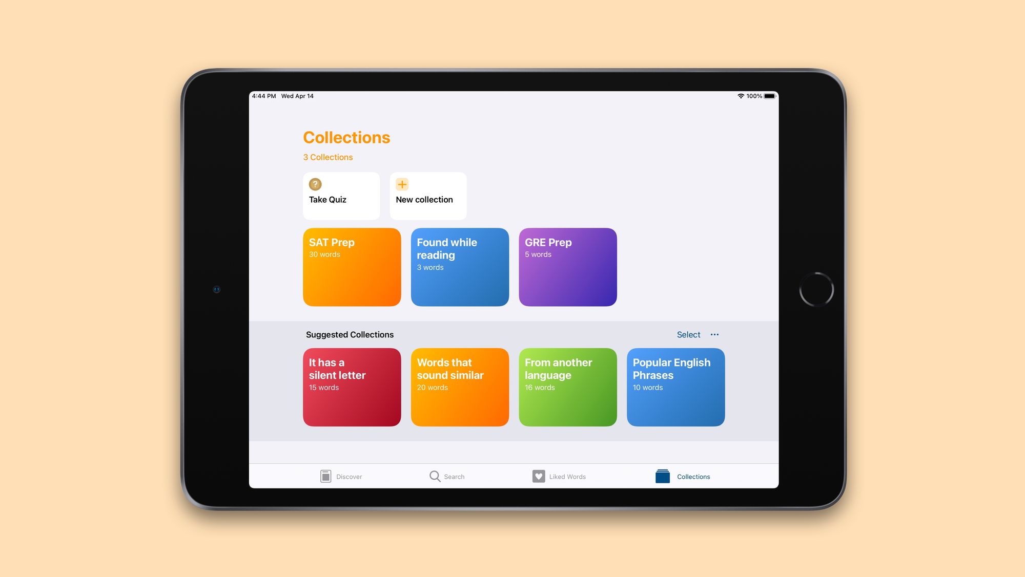
Utilising large screen spaces
A 12.9" iPad is extremely similar to a Macbook in size, and so where required, we have extended the multi-column layout to a 4 column layout to better use the larger screen space.
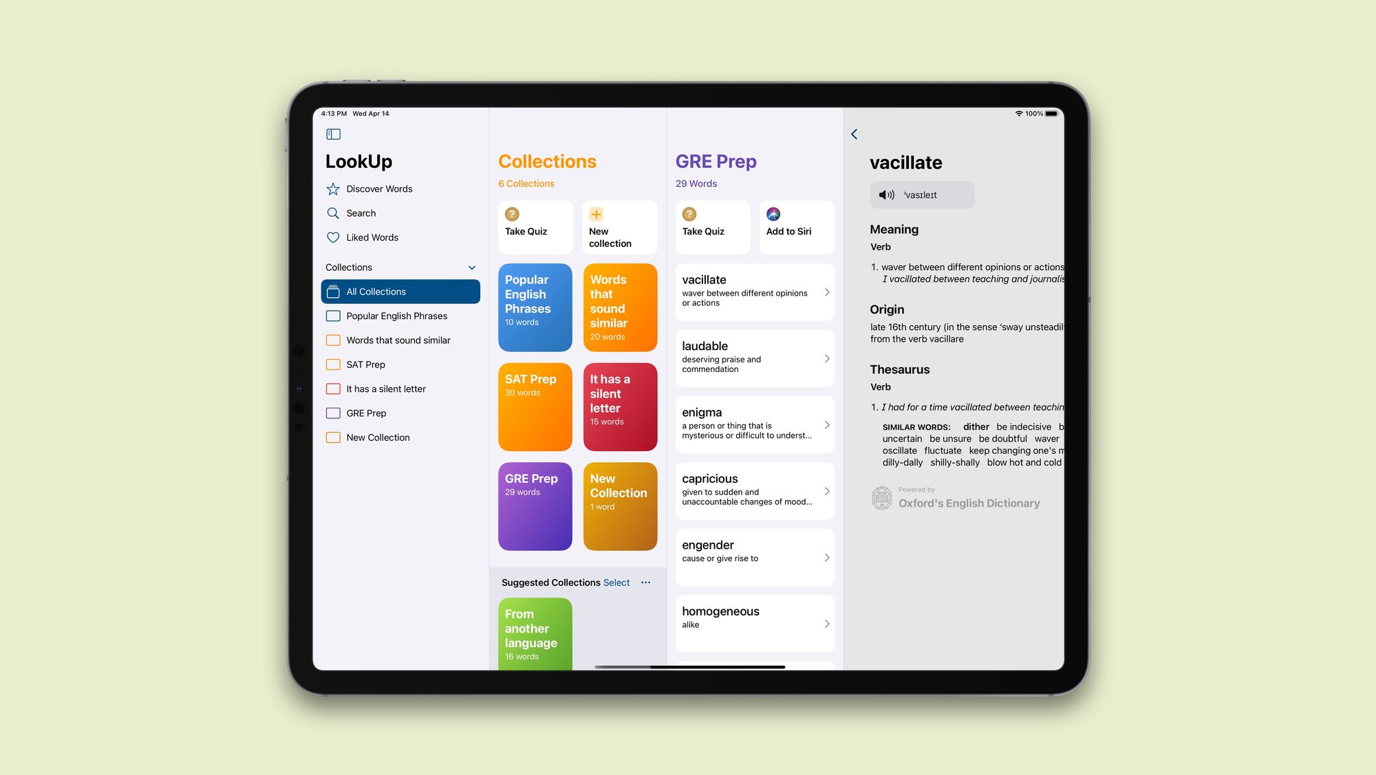
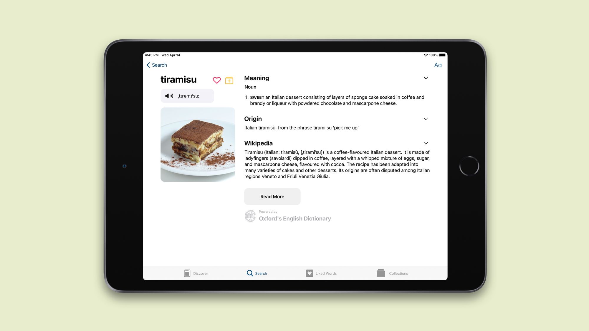
Sidebars + Contextual Menus = Pro Navigation
Contextual menus are a quick way to access parts of an app that could require multiple taps. They're secondary navigation; shortcuts to different parts of the app. So we've added extensive support for contextual menus in the sidebar.
For example you can quickly take a collections quiz by simply right clicking that collection and selecting the quiz option from the menu.
Providing a Flexible Interface
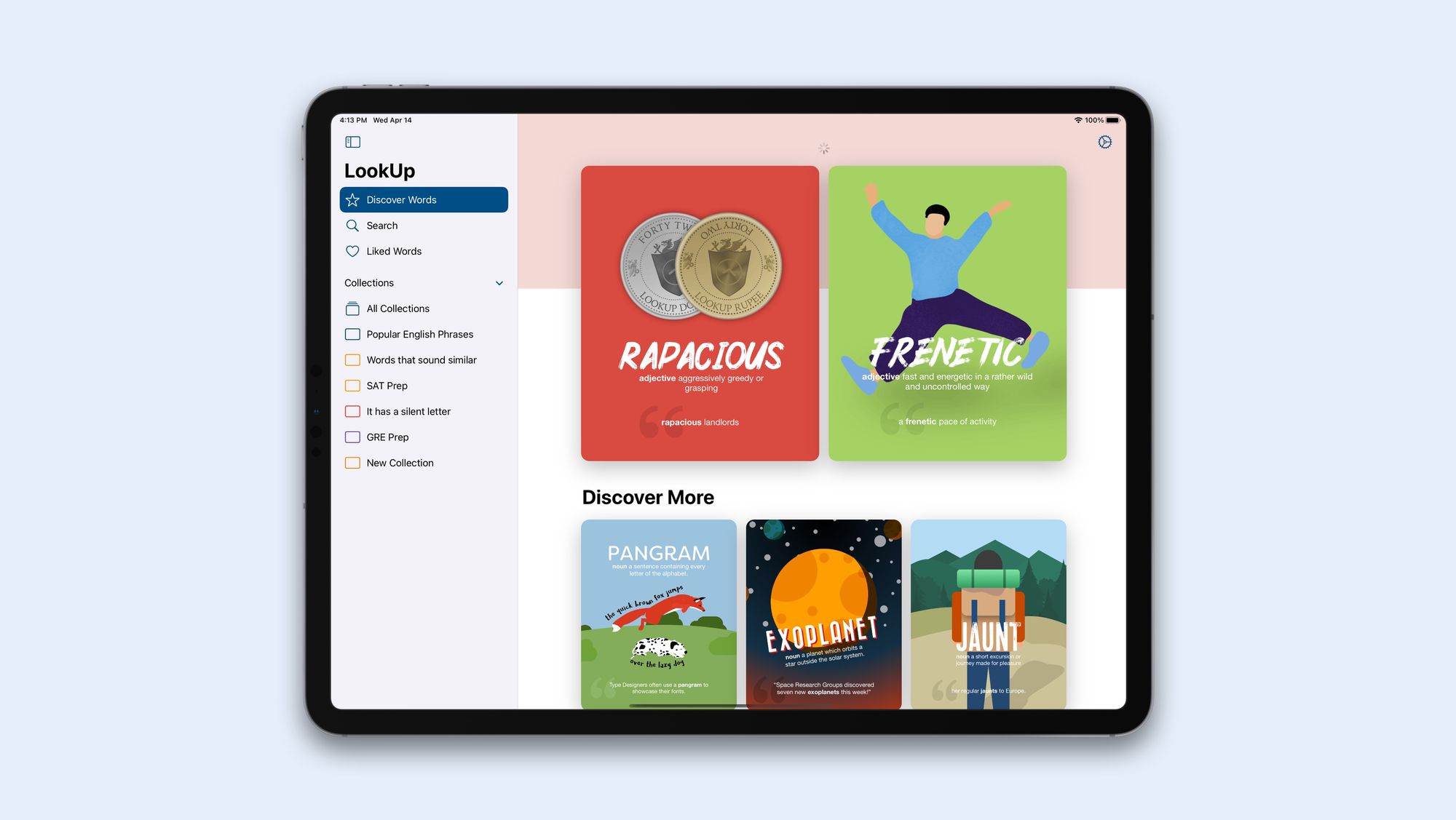
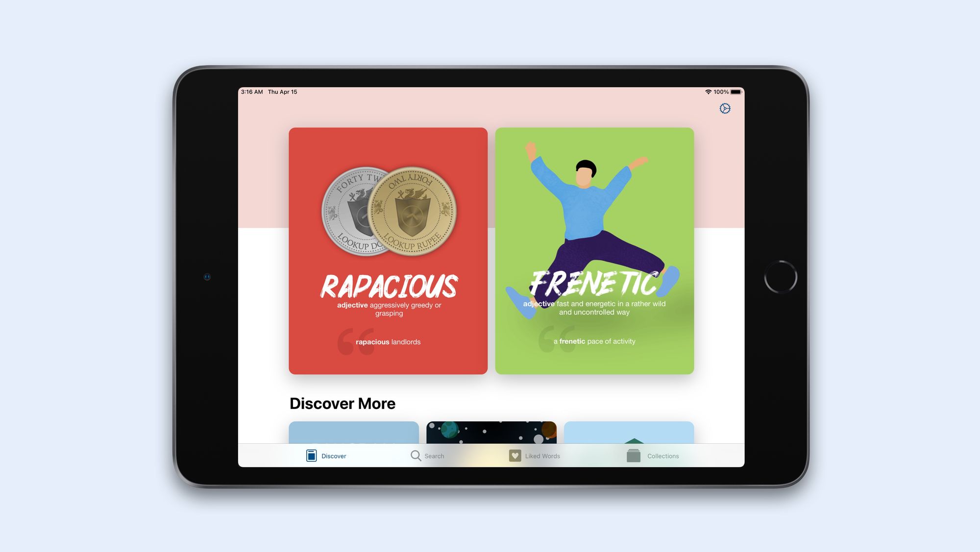
The sidebar, multi-column navigation is great for large iPads with a keyboard and mouse setup. However, that's not how everyone uses the iPad. In fact, smaller iPads like the iPad Mini or the 8th generation iPad are more hand-held than following a laptop like setup.
Currently there are two ways of using the iPad
- Used as a hand-held touch screen device where the user browses through the iPad, holding it in their hands or setting it down on a table.
- Used with a keyboard and mouse accessory.
Apart from how the iPad is held, it's size also plays a big role in how users want to use the iPad. Larger iPads are far more likely to fully take advantage of the sidebar interface as compared to smaller iPads like the Mini.
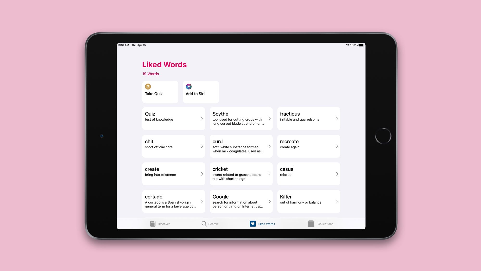
So LookUp will provide an option to switch to the traditional tab bar interface.
This is one of the design choices where I feel the context in which a user is using their iPad dictates what they'd prefer. And therefore, it's a setting that can be adjusted.
Seemless Window Resizing
A trivial detail but much of the technical work that's gone into making the sidebar navigation possible on iPadOS has been about making window resizing seemless.
Currently iOS 14 Split Views can assign a compact mode to enable a traditional tab bar layout for smaller screens. However, there's no default way to retain the views in both interface modes; and so they behave independently of each other, providing a disjoint user experience. Apple recommends doing work to retain the views, and that's where a good chunk of the sidebar development went into.
So this was a quick preview of the new iPadUI for LookUp. But that's not all, there are more UI improvements planned for the iPadOS app, like support for dragging and dropping words into a collection, a faster rename system that makes use of an inline layout and more. But more on that later.