After 6 months of development, LookUp 7.5 is now available to the users on the App Store.
What’s changed? Everything. On the outside, it’s still the familiar, easy to use interface of LookUp. But internally, the app has been completely rewritten for faster performance, better compatibility across all the Apple platforms, and hosts a new more reliable sync and storage system. It’s a major update to LookUp that’s filled little improvements across the app.
I wanted to talk about some of the major new changes coming to the app with this release.
1. Universal Purchase
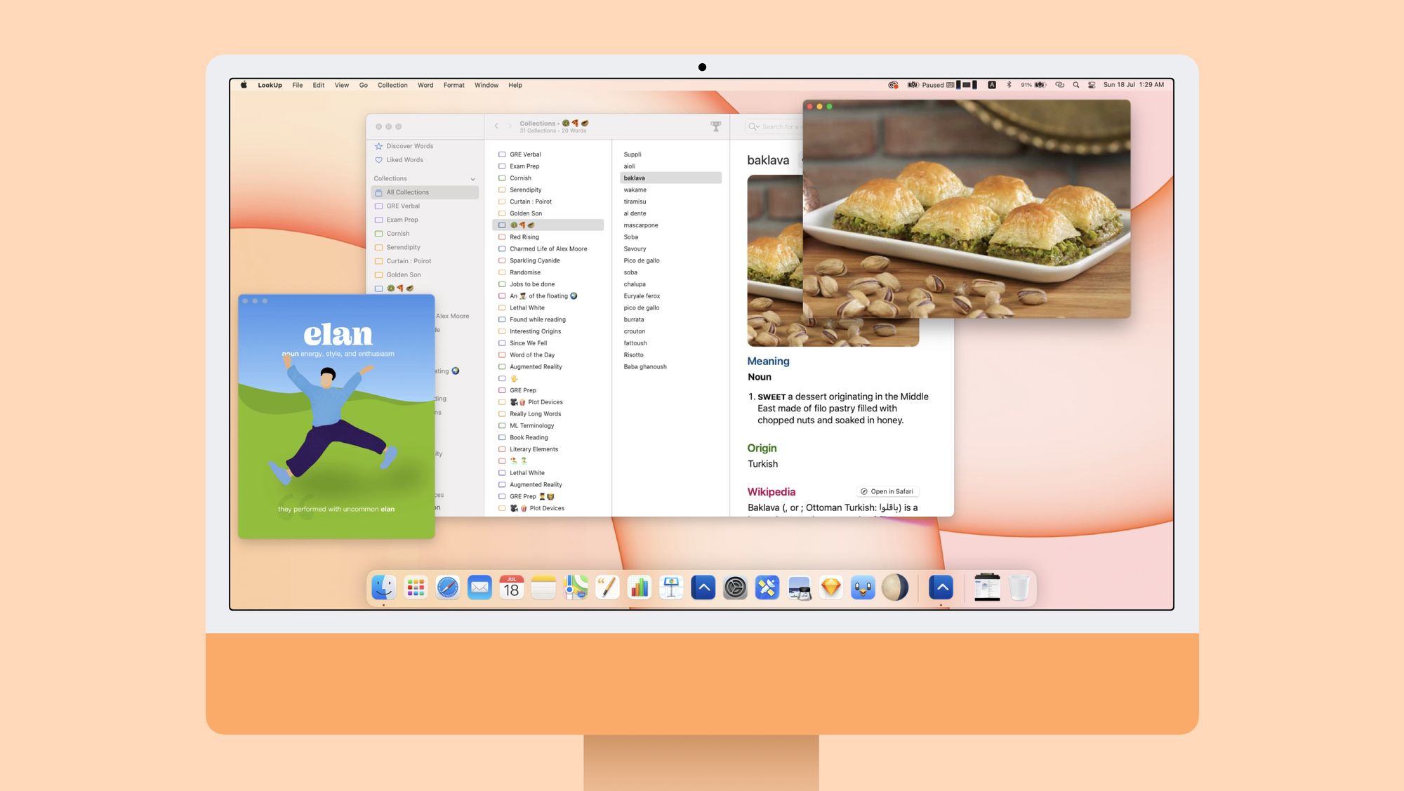
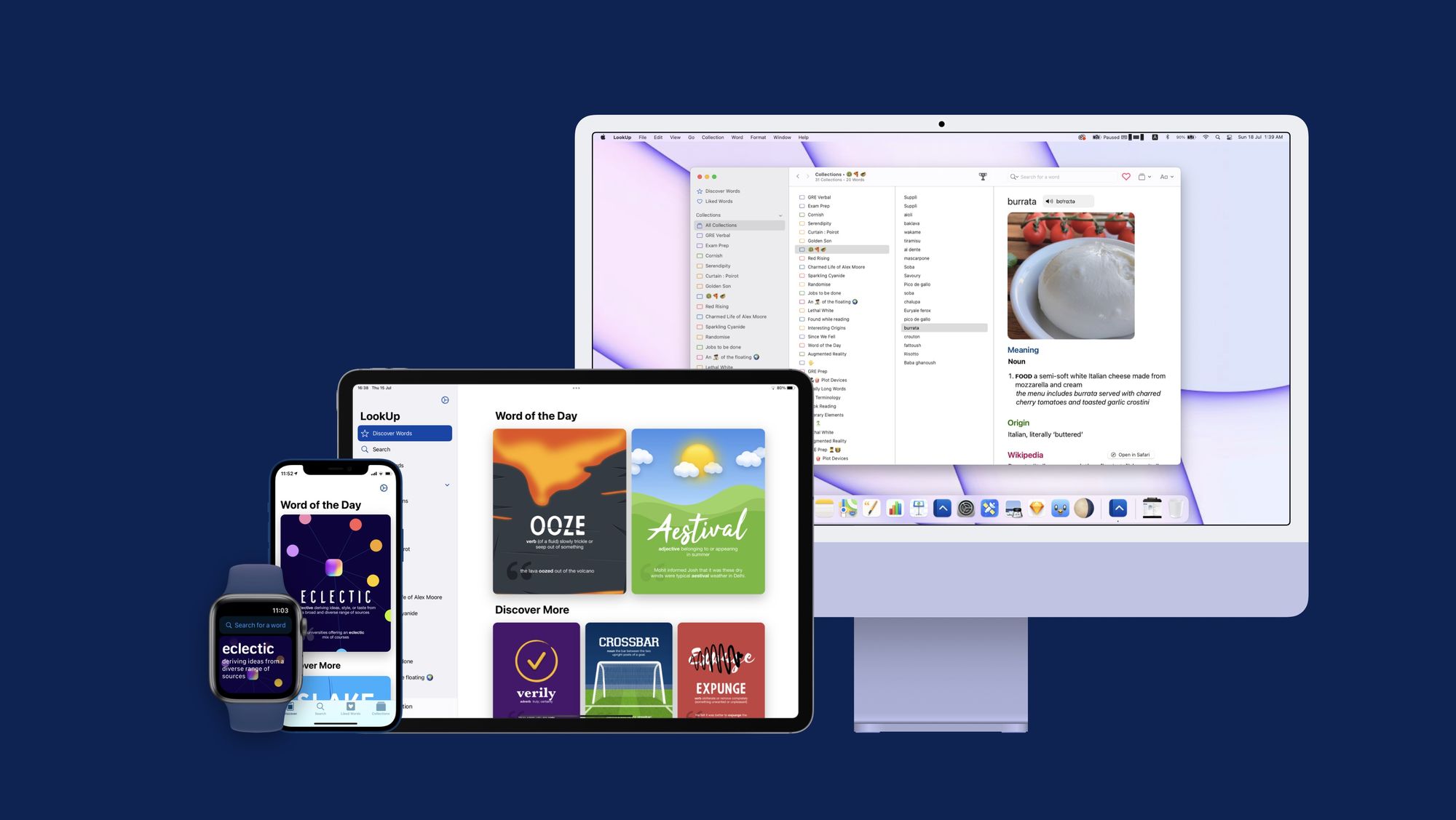
LookUp is now a universal purchase across all Apple platforms (iOS, iPadOS, watchOS and now macOS).
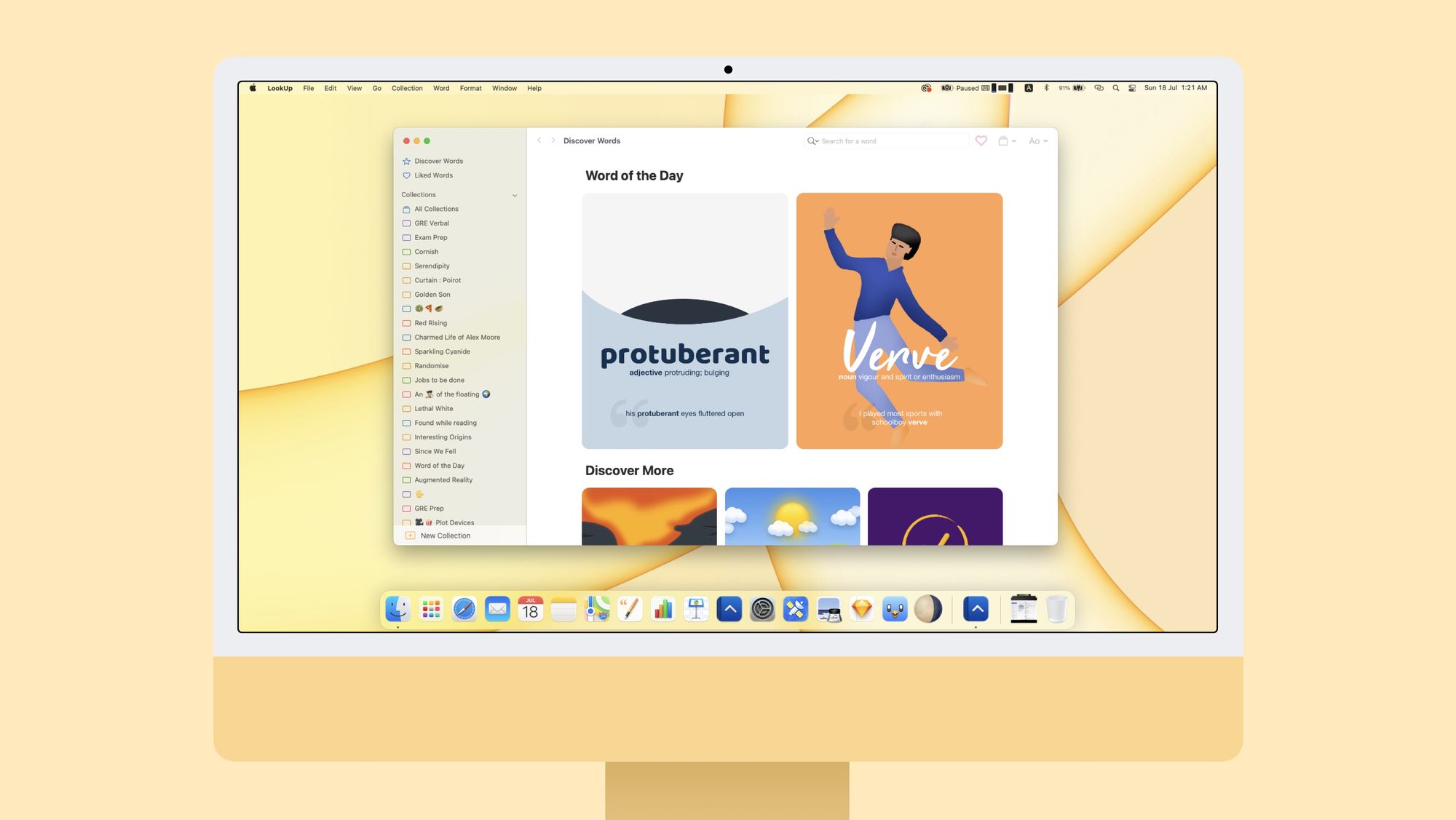
I wrote at length about it a couple of weeks ago on the blog; the gist is, that this will allow me to keep the apps in lockstep, and enable the app to provide a consistent user experience for upcoming features like Shortcuts for macOS and Quick Notes.
2. New iPad UI
LookUp’s iPad UI has also been completely rethought for a flatter navigation structure. The iPad app now features the Sidebar UI that Apple first introduced last year. It also supports dragging and dropping words into different collections; and shows inline editing tools where required.
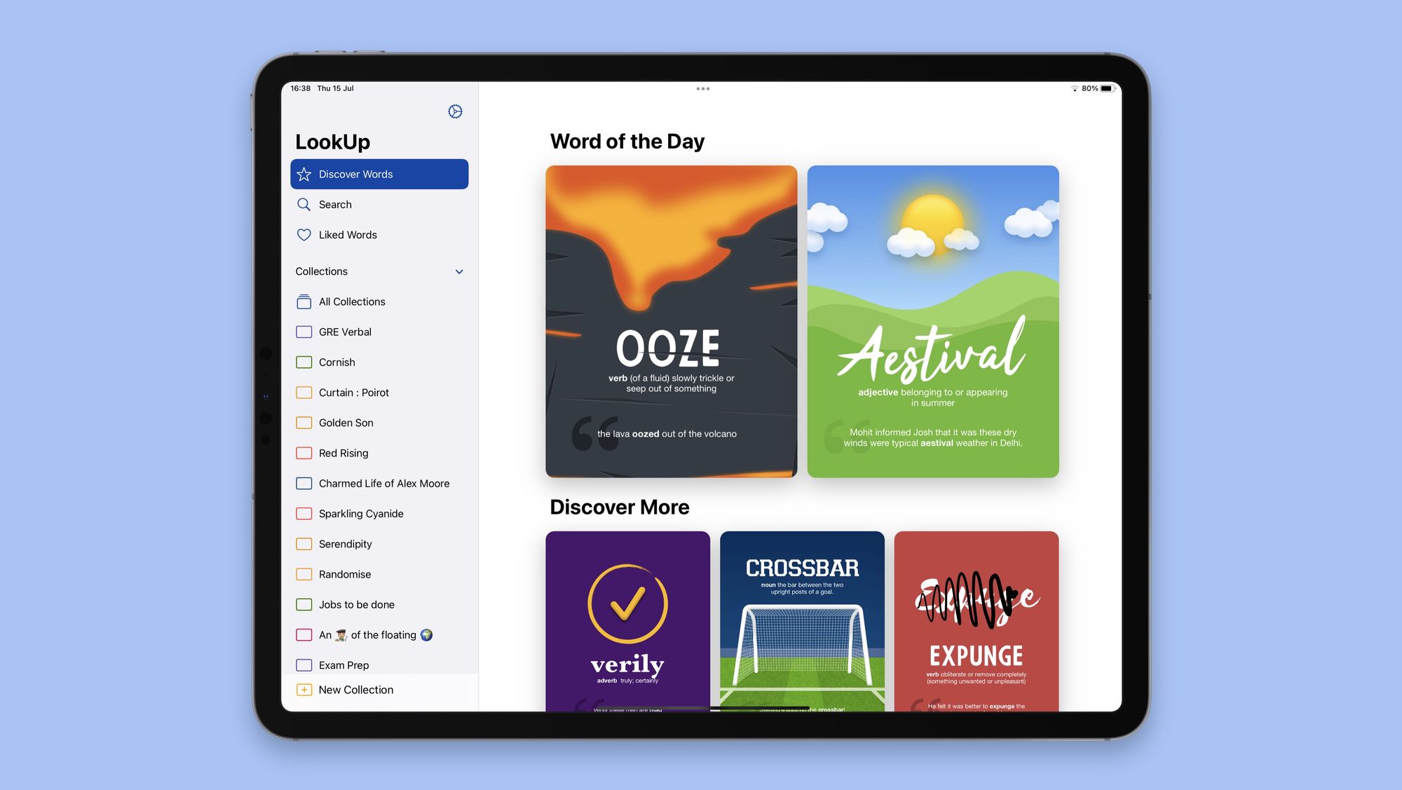
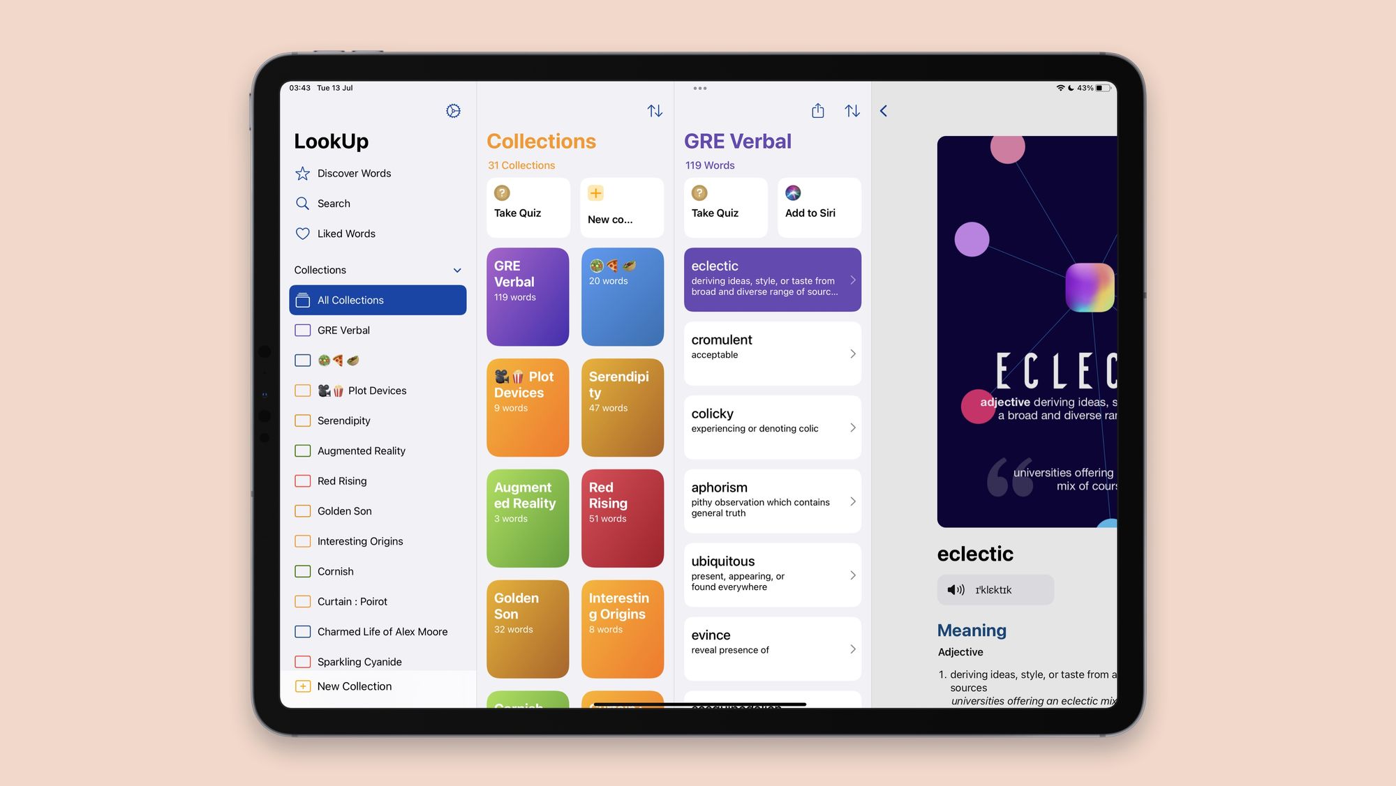
Since the sidebar UI can sometimes be jarring on smaller form factors, there is also a new Layout Settings page in Settings to use the tab bar layout (this is especially useful, when using iPad mini or other smaller iPads).
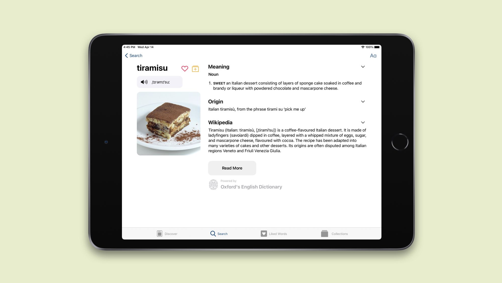
I’ve written about the new iPad previously on the blog and will soon be sharing more about how I designed it.
The app also includes Layout customisations to further customise how you want to see your definitions.
3. Exporting Collections as PDF:
Users can now export collections as PDFs and share with their friends. This is something that was designed keeping in mind students who use the app as a learning tool.
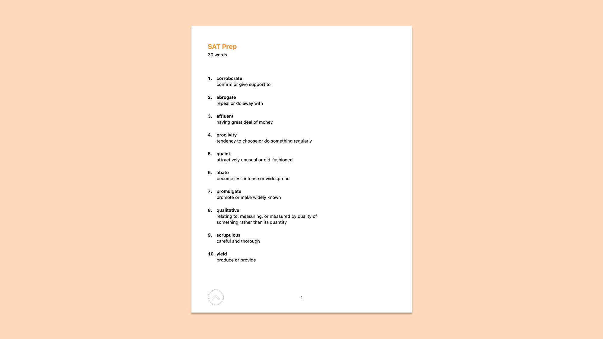
It’s a small utility, but one that I hope lots of students to benefit from. The PDFs are all designed in a way that look good on printed paper, so if students want to share these lists around they can do that too.
4. Sorting Collections
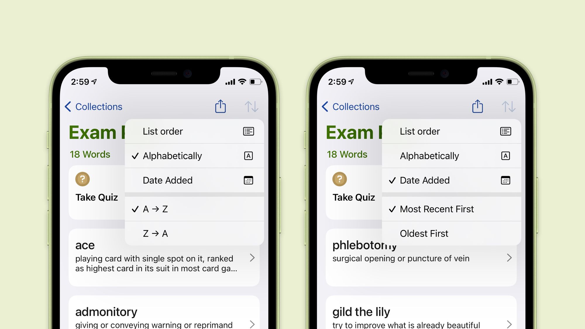
You can now rearrange and sort collections in different ways. There a couple of pre-defined sorting options (Alphabetically and Date added) but you can also create your own list order simply by dragging and dropping the word into a position of your choice.
5. More Results
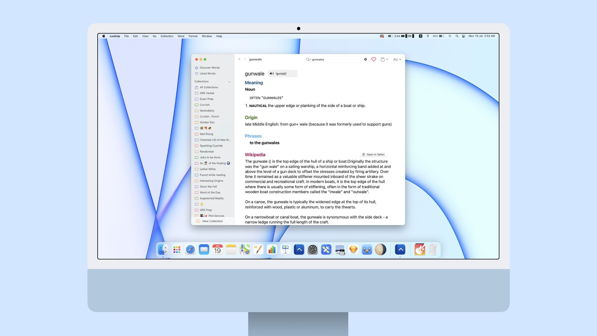
The Search results have also been revamped to include Phrases. The Definitions have also been updated with more detailed definitions.
6. Search Widget
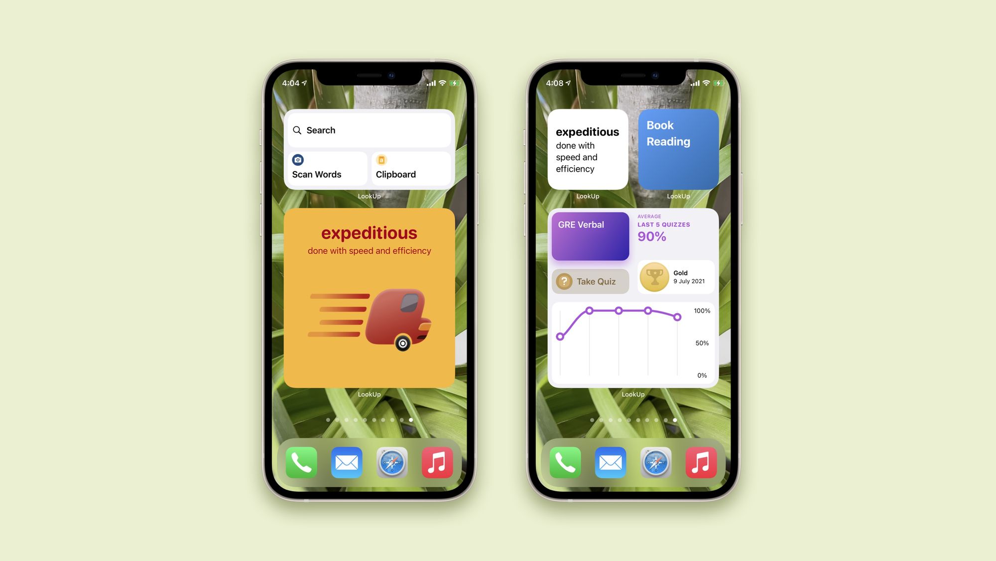
While each one of the previous widgets have got significant performance improvements, there’s also a new Search Widget for iOS and iPadOS users. That allows a quick access to the actions in the Search Screen: (Search, Search from Clipboard or Search by Scanning a Word)
7. Shortcuts Improvements
The Shortcut actions in the app have been updated to show more output details making it easier to chain multiple shortcut actions.
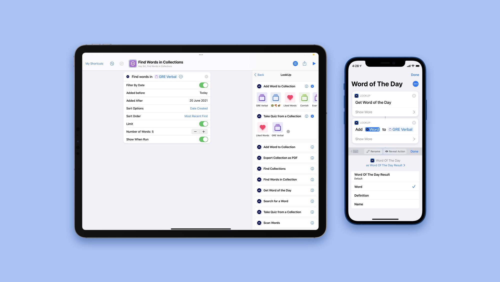
The app also includes new actions for taking quizzes, finding words in a collection, and finding and exporting collections. These are useful, flexible actions that allow users to create powerful actions, making it easier to automate parts of the app without even launching it.
These are some of the salient features of today’s update. The update is filled with little details such as Layout customisations, options to choose a pronunciation voice, a completely revamped action extension and more.
Hope you enjoy using LookUp!
You can get LookUp: English Dictionary from the App Store: here

