The next major release for LookUp: English Dictionary is coming soon, and I wanted to share some notes on what's changing:
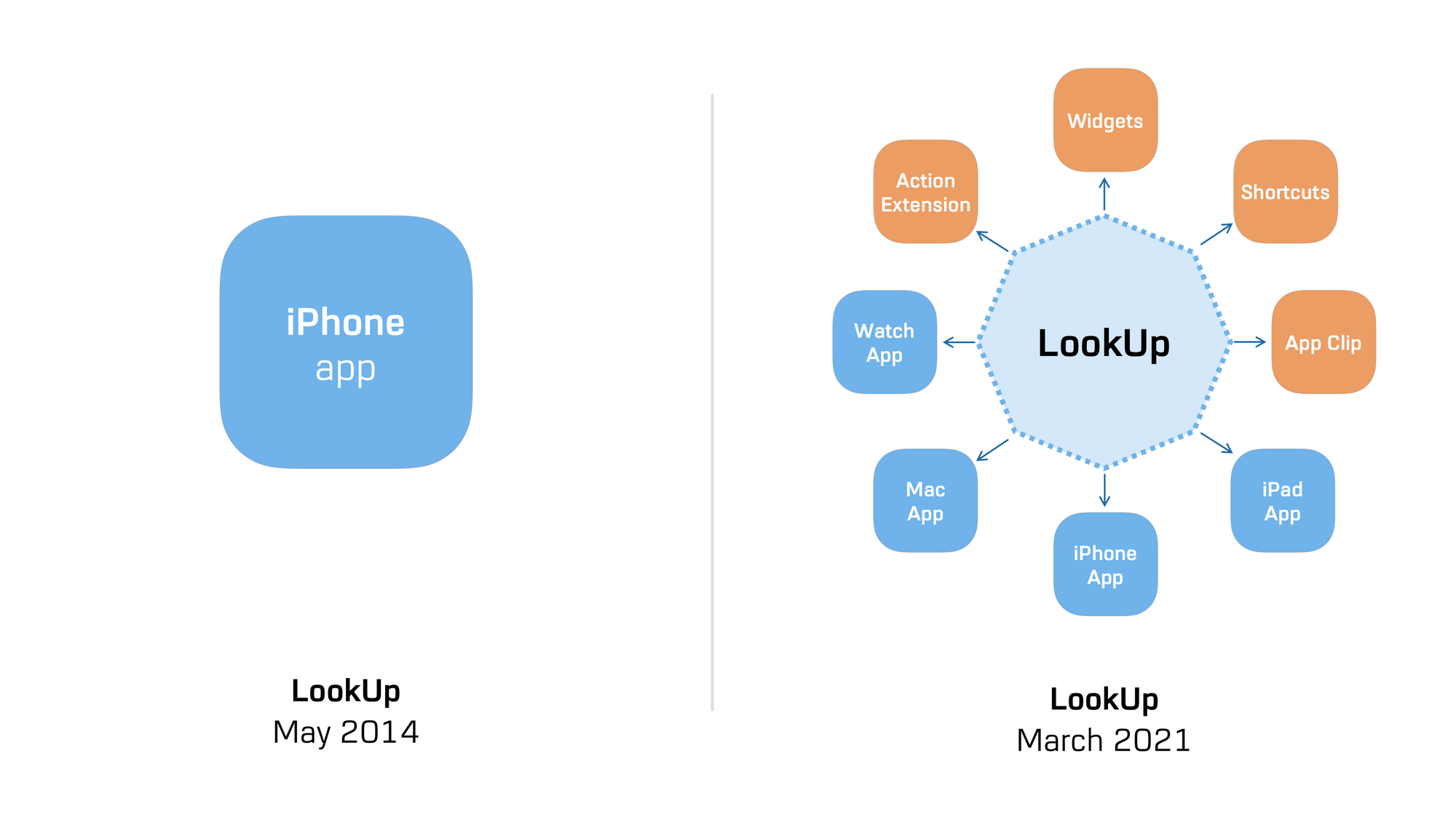
When LookUp first released on the App Store in may 2014, it was meant to be an iPhone app, and iPhone at the time meant one device, one screen size and a pixel perfect UI.
Over time, the app has expanded into bringing in new features, supporting different platforms and using system extensions such as Shortcuts, Action Extensions and most recently Widgets. The app has expanded from being a one device app to something that scales from the Watch to a Mac.
All this is built on top of a codebase that was designed for the iPhone app. And while the app's doing fine right now in terms of performance, to enable the next set of major new features, it needs a bit of a rejig.

So, I'm rewriting LookUp from the ground up, to be a more modern, robust and reliable experience.
What does this mean for the user?
While users may not see any new features in this particular release, they'll observe an overall improvement in the the app, whether it be little UI tweaks or minor reliability improvements. That'd also mean fewer errors when using extensions, a snappier user experience and an experience that's more integrated across platforms. Overall, the app is just going to feel much nicer.
Why the rewrite?
First, It's been a long time since I refactored and rewrote a bunch of things in this app, and as new features get added, I find myself writing a lot of redudent code.
Secondly, There are a bunch of features I'd like to build into the app, but it's proving to be extremely challenging to create them in a satisfactory way with the app's current codebase. And if I were to not change anything with the code, it'd eventually lead to a fragmented, frustrating experience. So, the much needed rewrite.
For example to make the upcoming word notes feature in the app, I want the user's annotations and notes on a word to be able to sync across devices so they can access them easily.
The current codebase could do that, but neither the result screen's current UI, nor it's data model would help create the experience I want, and the result would be something sub-par that people don't end up using. Rewriting the app is helping create such newer experiences be available everywhere with ease.
Over the next few updates to the app, you'll see the app improve manifold. Previously all major changes could be packed into a single release in the fall but since the app's much bigger now, I want to take an iterative approach to changes. Making sure new features work robustly for a longer duration.
Starting with a major internal refresh to the app. Followed by some exciting new features, and a major design overhaul, over the course of the next one year.
What's next?
I hope to start a closed TestFlight Beta for the update by the end of March, and release the update a few weeks later.
With more major updates to the app arriving in Fall 2021, and Early 2022.

